Driving trust and Early Adoption in AI-Generated Clinical Notes
Researched and designed in partnership with clinicians, product, and engineering at Suki.ai
Myself - Researcher, Product Designer
Product Manager, ML Lead, Frontend, backend engineering
My Role & Skills
About
Suki is an AI-powered healthcare assistant that uses ambient listening to capture clinician–patient conversations and generate specialty-specific clinical notes. While the output was clinically accurate, we found that physicians are extremely particular about how their notes are styled, and the defaults were quickly eroding trust in the product’s time-saving promise.
We explored multiple approaches to facilitating personalization, ultimately designed a self-serve system that let doctors shape how their notes were written from day one, which improved early adoption, trust, and helped the AI feel like a reliable extension of their workflow.
Researcher, Product Designer
Qualitative user research, Competitor analysis, Concept testing, Product thinking, UX strategy, Time-to-value optimization, UI Design, Stakeholder management
Duration
4 Months, April - July 2024
The team
Suki's core offering had always been scribing clinical conversations. By April 2024, the AI was doing the medical side well. It wasn’t missing diagnoses or meds, but,

THE PROBLEM
Doctors were paying 'The Editing Tax'.

Standard note output forced clinicians to spend 5–10 minutes editing each note. >20% of negative feedback in the prior quarter cited style mismatch, based on ProductBoard insights from NPS, CS reports, and user emails. In healthcare, where users often churn rather than complain, the true impact was likely much higher.
Our task was to establish a clear, actionable strategy to improve this experience within the quarter.
PHYSICIANS SAID
IMG 01: Selected ProductBoard feedback from Q1 2024 (Sources: Clinician feedback emails, NPS responses, and CS-reported clinician issues).


Preferred style elements were different across note types and sections.


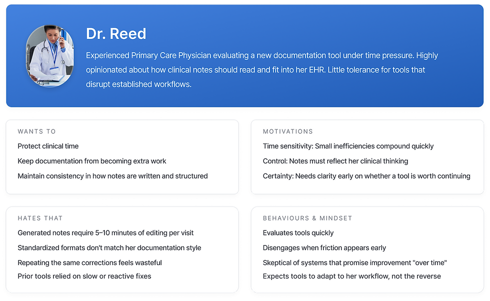
WHO'S ASKING? - THE TYPICAL USER
A week of on-site clinician shadowing revealed how time pressure and skepticism toward AI shaped documentation behaviours. These insights would directly inform how we designed our solution for trust, speed, and minimal disruption.
IMG 02: Persona of a typical new Suki user, determined from interviews and shadowing with >30 clinicians.
EARLY IDEAS?
We spent a week in Design-PM-ML brainstorms to ideate and map out potential solutions.
After exploring multiple directions, we distilled the work into four clear concepts and tested these with 12 clinicians for early validation.

THE GOLD STANDARD NOTE
Upload a "perfect" note and mirror its style
✓ Low cognitive load, familiar mental model
✓ Fastest path to personalization when a clean example exists
✗ Assumes users have a perfect note (many don't)
✗ Style is subjective and inconsistent across sections
✗ Small formatting quirks disproportionately influence output


INSIGHTS
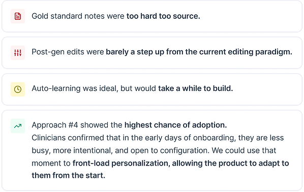

DESIGN DECISION #1
The ML team would experiment with learning user preferences over time. However, solving this would take longer than a quarter, and wouldn’t address the 'cold-start problem'.
ML could optimize the experience eventually, but we needed to deliver value immediately. Move personalization to the front of the experience.
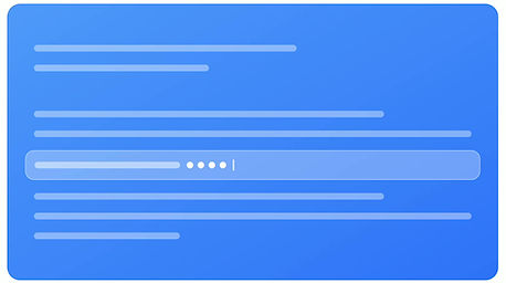
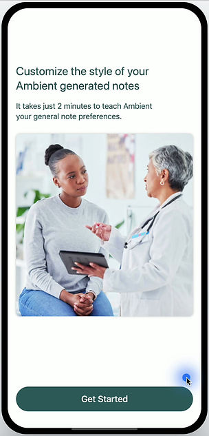
PILOT SOLUTION
We designed a linear onboarding settings flow that lets users mark one-off preferences across a limited set of Suki note sections. The experience was intentionally low-click, enabling setup in two minutes or less.
DESIGN DECISION #2
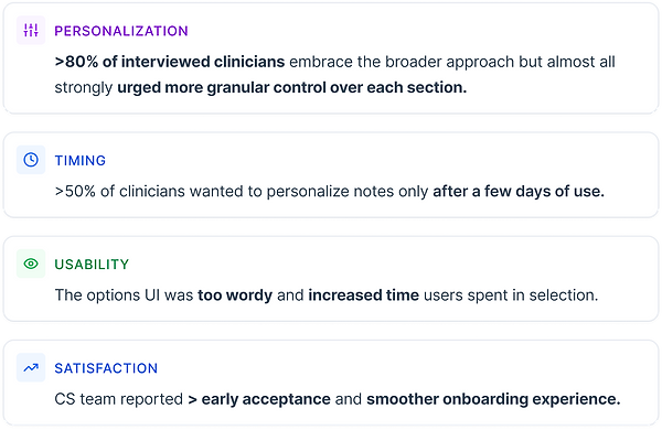
The core premise resonated with clinicians, but needed more robustness to be truly useful.
Our settings model must evolve to support multiple interdependent parameters within a single note section.
DEEPER DIGGING
We broadened the range of customizations, focusing on the note sections with the greatest impact on clinician satisfaction.
These preferences follow an n-to-1 model, where multiple settings define a single note section.
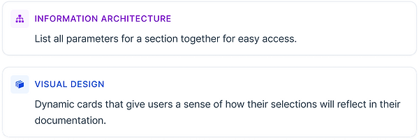
Settings must be logically grouped, allowing clinicians to make a single, targeted change with minimal effort and clicks.
Because these preferences are interdependent, the experience must help users understand the holistic impact of their changes on a section.

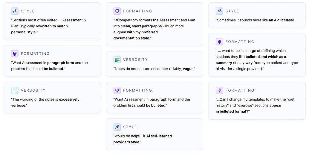
IMG 03: Key clinician requests for note structure changes, synthesized from Pilot and ProductBoard feedback (Q1 2024).
REFERENCES?
We looked into instances of complex, inter-linked settings being applied across other apps and use cases.
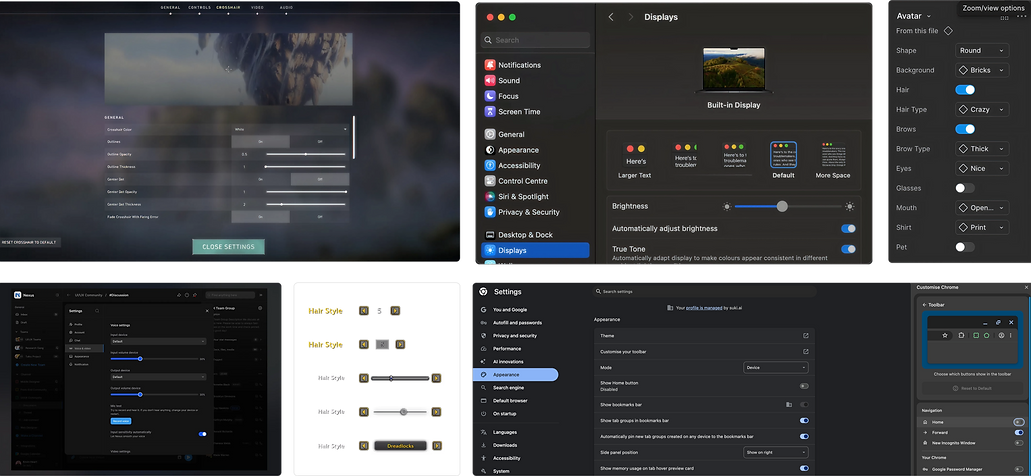
IMG 04: Screens from exploratory research examining patterns for managing interdependent changes in complex use cases.
INSIGHTS
DESIGN DECISION #3
Clinicians in the pilot spent too long reading through each option on the UI.
Redesign dummy copy to reduce decision time and cognitive load.
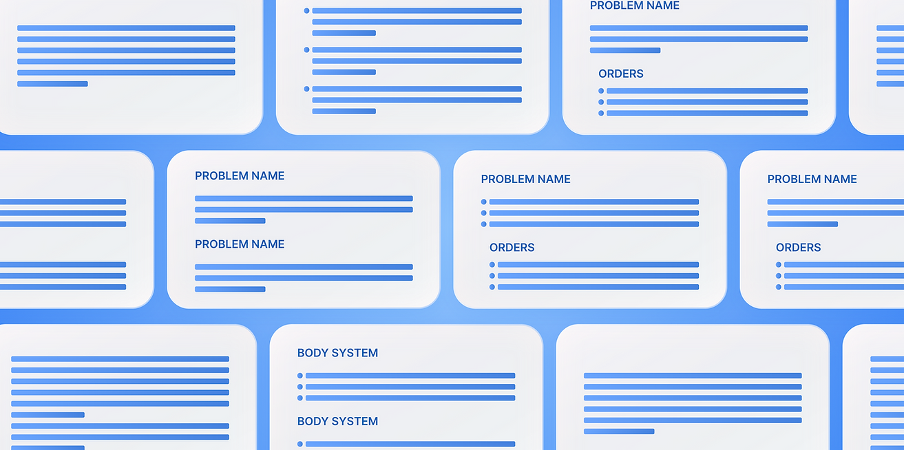
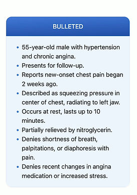
We explored multiple UI options, from dense text to minimal structures, landing on
the minimal horizontal-line representation that kept the design lightweight and easy to scan
-
We aimed to reuse the same UI across all specialties, and build a small set of flexible components that could be recombined to support new settings.
-
Long term, the feature team would be able to ship changes faster, and add new configurations without increasing design or engineering complexity.
UI VARIANTS
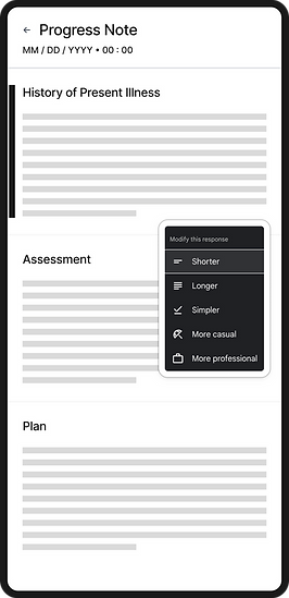
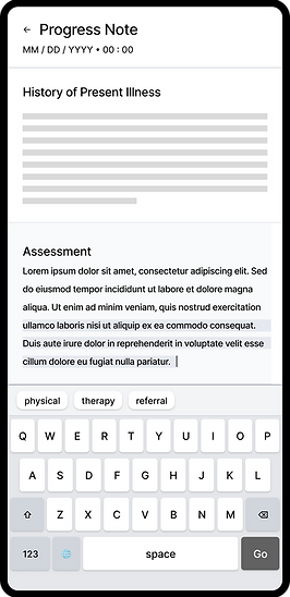
PULLING IT ALL TOGETHER - FINAL SOLUTION
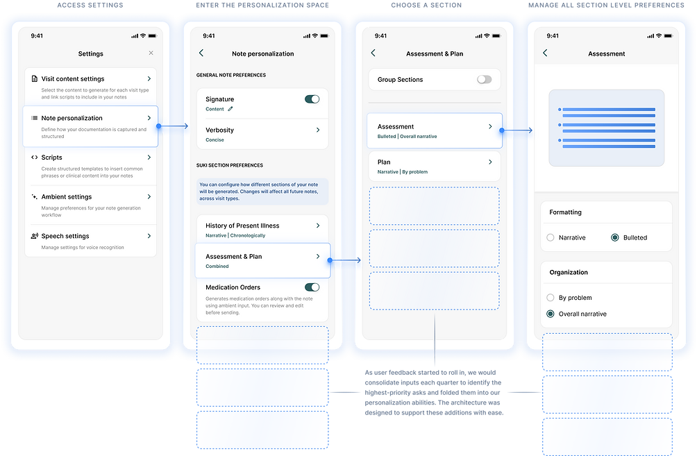
A central space where users can tweak note section preferences and instantly see how their choices shape the document.
COMPONENTS

IMG 05: Base component card specs
IMG 06: Card content pieces and visual guidelines

© 2023 Malavika Vijayan. All Rights Reserved.
Made with love, Figma and many Vanilla Lattes
Write to me on @v.malavika297@gmail.com if something caught your eye. Always open to chat!