Escrow Services Dashboard
Designing a 0–1 SaaS escrow platform for B2B transactions — three user types, one complex status flow.
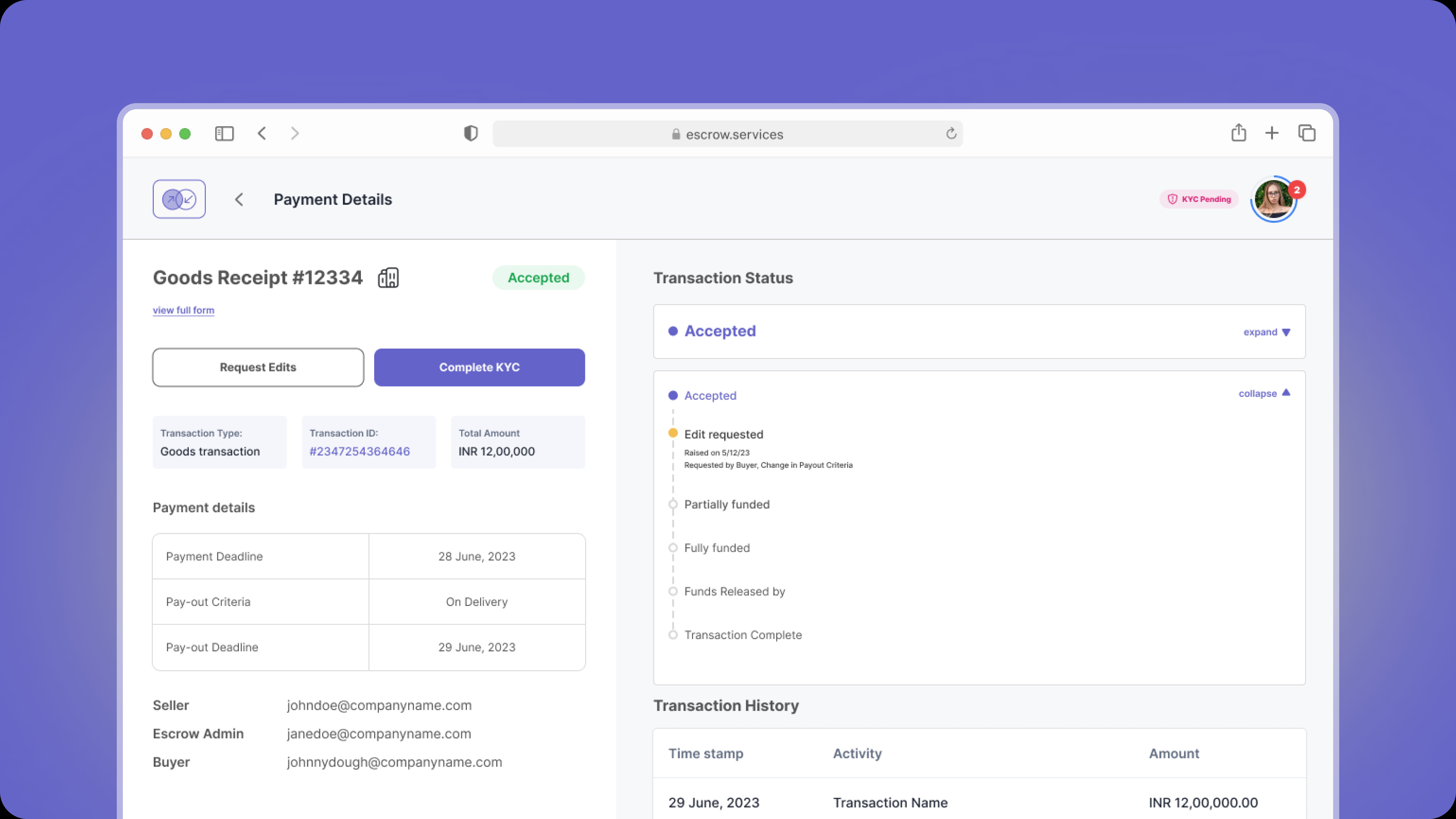
A client approached us to build a SaaS escrow platform for B2B transactions — a space traditionally limited to real estate. In a domain where a single design misstep can erode the financial trust of both parties, getting the experience right mattered. The initial brief was limited to an admin dashboard; what we shipped was significantly broader.
Starting with people, not the brief
The client wanted the admin dashboard first. We pushed back. Escrow existed in the world, people had used it in real estate, and they had opinions about what worked and what didn't. We had to understand that experience before designing anything.
What we found
Escrow is, at its core, a trust mechanism. Everything we design must be in service of that one metric.
How we worked

The design process
Four key players




An overview
Agreements change, amounts shift, deals collapse. Money triggers anxiety, so flexibility and a clear exit path had to be built in from the start. Working sessions to map the end-to-end process aligned all stakeholders before any design work began.
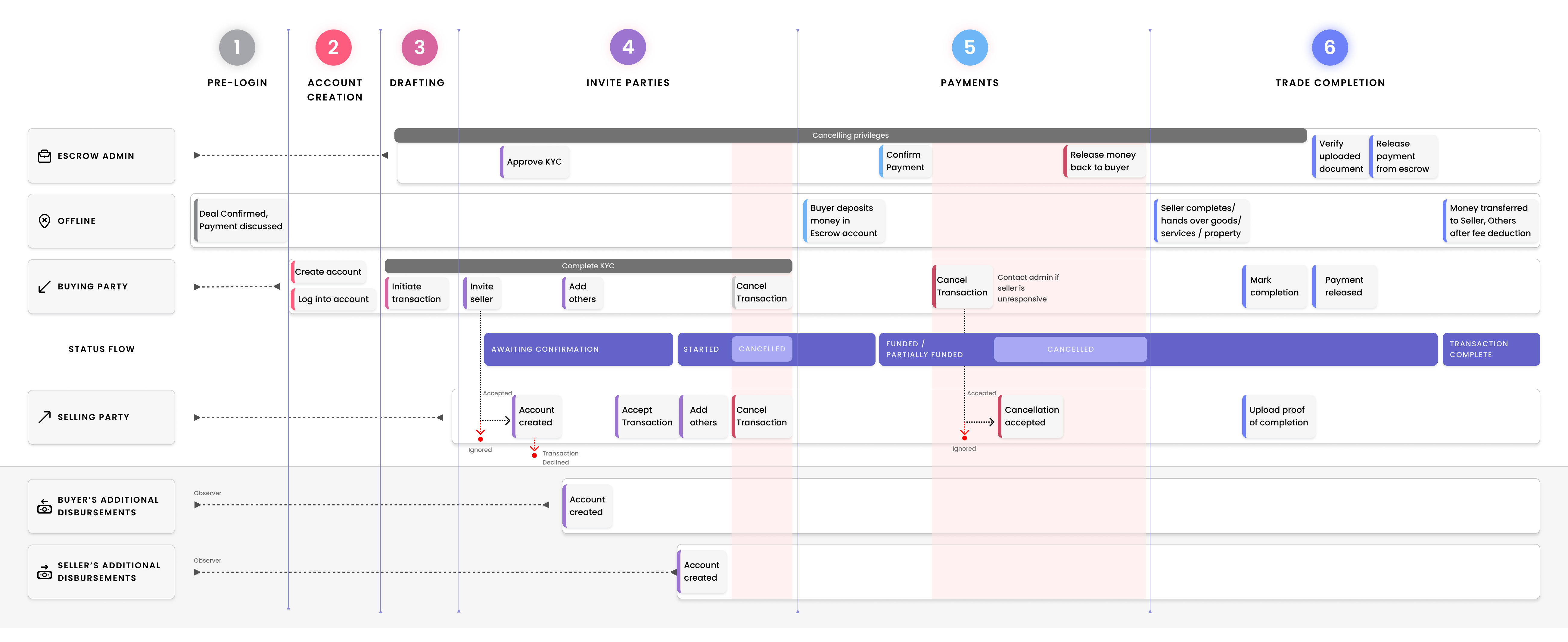
Fig. 1 — End-to-end escrow process overview mapping all three user roles across the transaction lifecycle.
The brief asked for an admin dashboard and transactional emails. We pushed for three surfaces: a public-facing website, a buyer and seller dashboard, and the admin dashboard. Buyers and sellers couldn't transact on trust alone with only emails and phone calls as their interface. Due to time constraints, v01 covered the three primary personas; disbursements were documented and deferred to v02.
Three surfaces
Most businesses had never used an escrow service. The landing page had to explain it, build confidence, and make sign-up feel approachable.
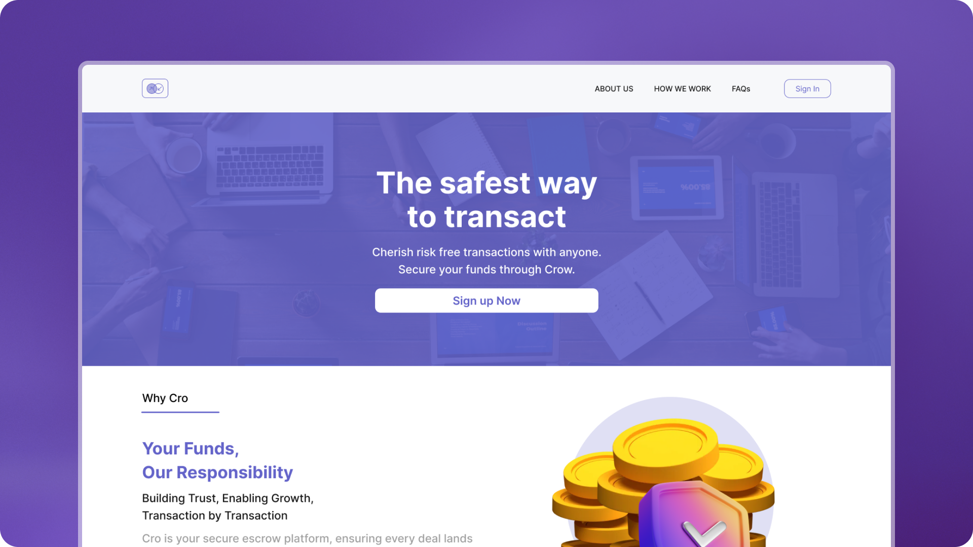
Fig. 2 — Public-facing website: homepage, pricing, and sign-up flow designed to build trust before the first transaction.
Buyer and seller need different things from the same transaction. Building a scalable system that encompassed both was the challenge.
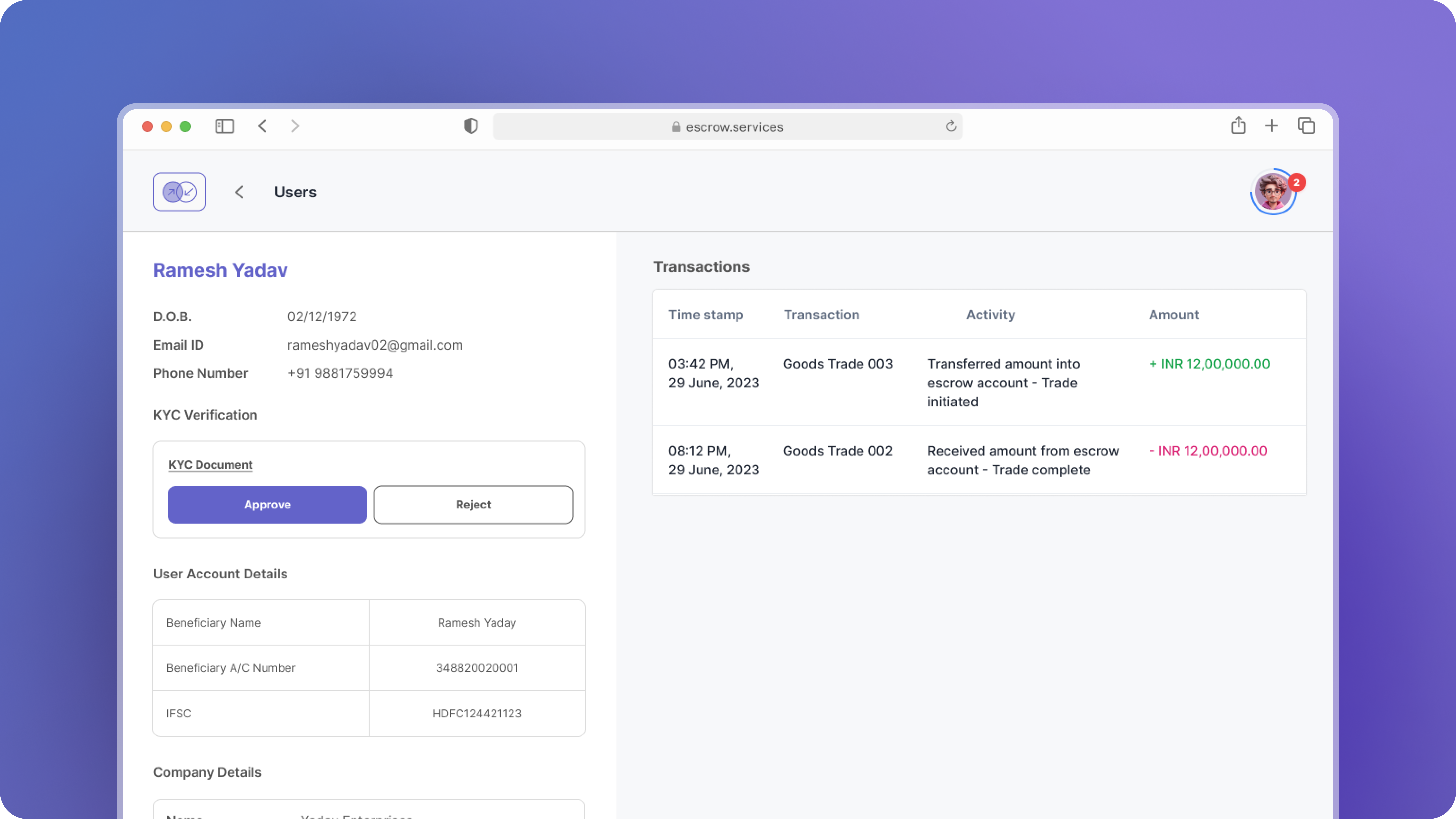
Fig. 3 — Buyer and seller views of an in-progress transaction. Same status model, role-specific actions and information.
Identity verification, stalled transactions, fund release, disputes. The original brief wanted this surface alone, but their efficiency depends on the user-facing surfaces enabling autonomous transactions for most of the experience.
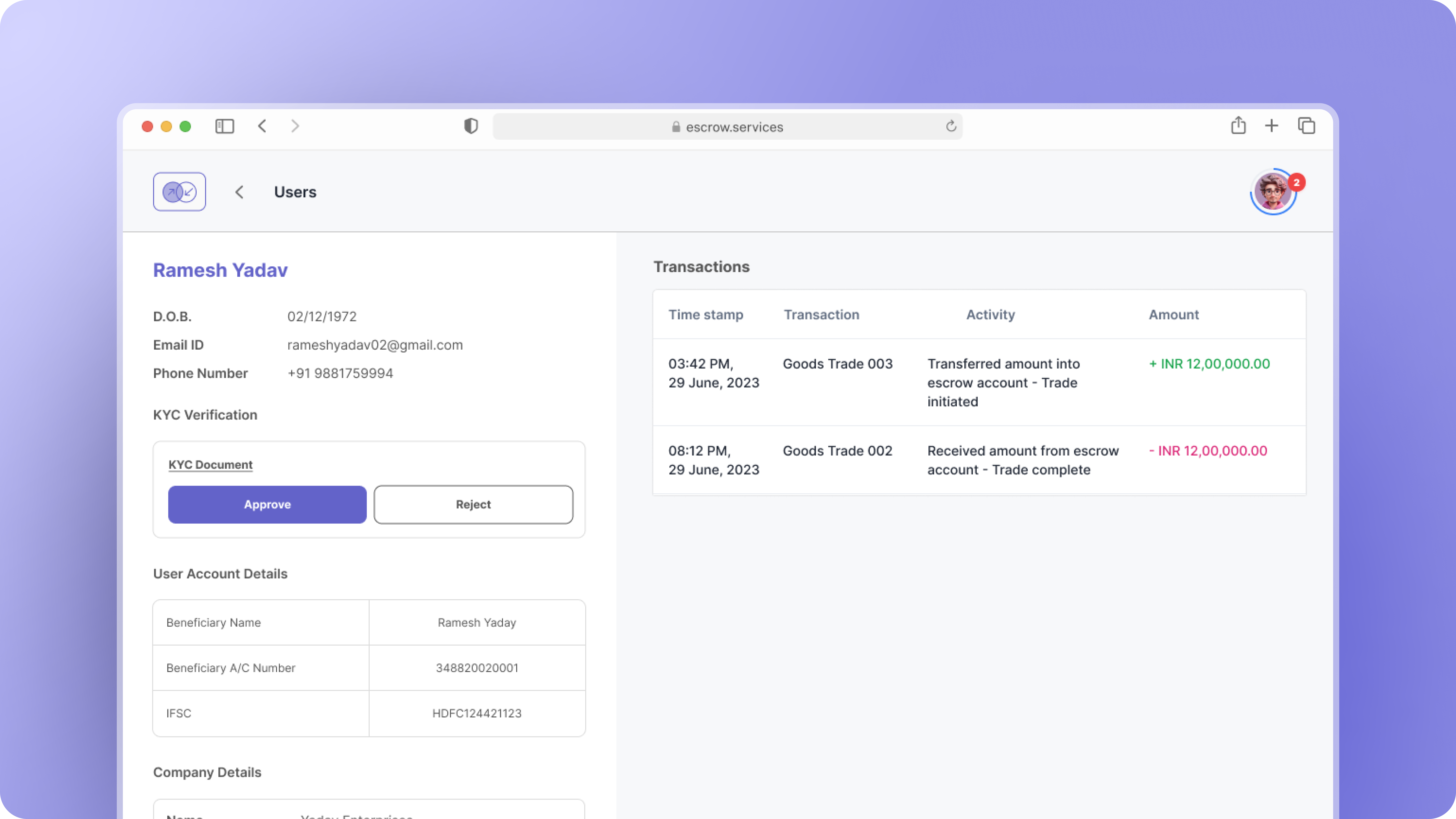
Fig. 4 — Admin dashboard: transaction queue, KYC verification queue, and dispute management in a single view.
Wireframes
Early and iterative wireframes resolved what each role could see on shared screens, and how status maps to actions rather than just states. The journey maps shortened this phase significantly.
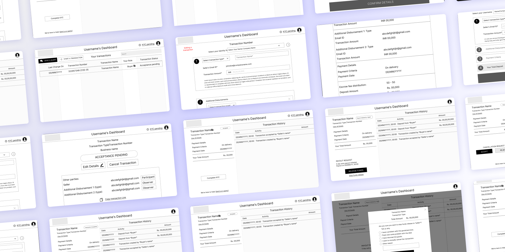
Fig. 5 — Mid-fidelity wireframes covering buyer initiation, seller acceptance, and shared transaction status screens.
The design under pressure
John is initiating a high-value transaction for a batch of goods. Payment releases only when delivery is confirmed.
Amelia is preparing to ship. She needs terms locked and proof of funds before anything moves.
John creates an account and starts the escrow process.
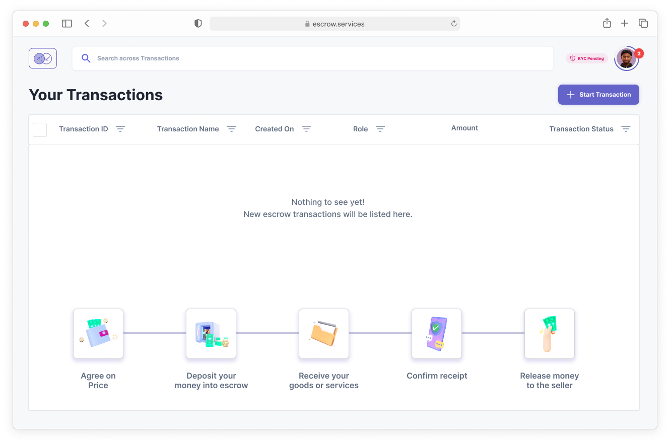
Fig. 6 — Account creation and onboarding. Trust signals are established before the buyer initiates their first transaction.
John fills in the details, tags Amelia and any disbursements. He can save, return, or discard before sending.
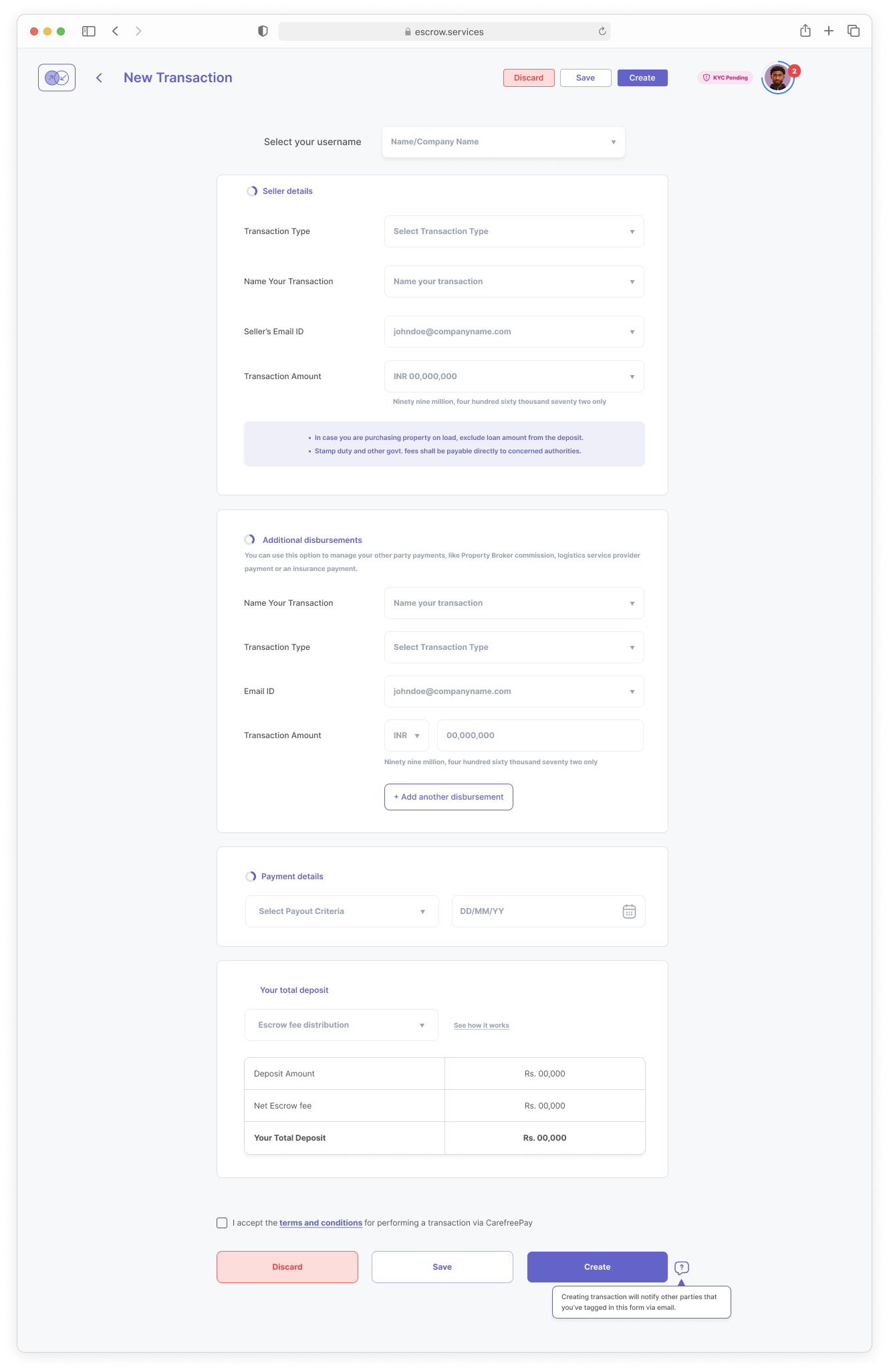
Fig. 7 — Transaction drafting: amount, counterparty tagging, terms, and disbursement splits. Drafts are saved automatically.
John sends the created transaction. Amelia accepts or requests changes. He can run other transactions in the meantime.
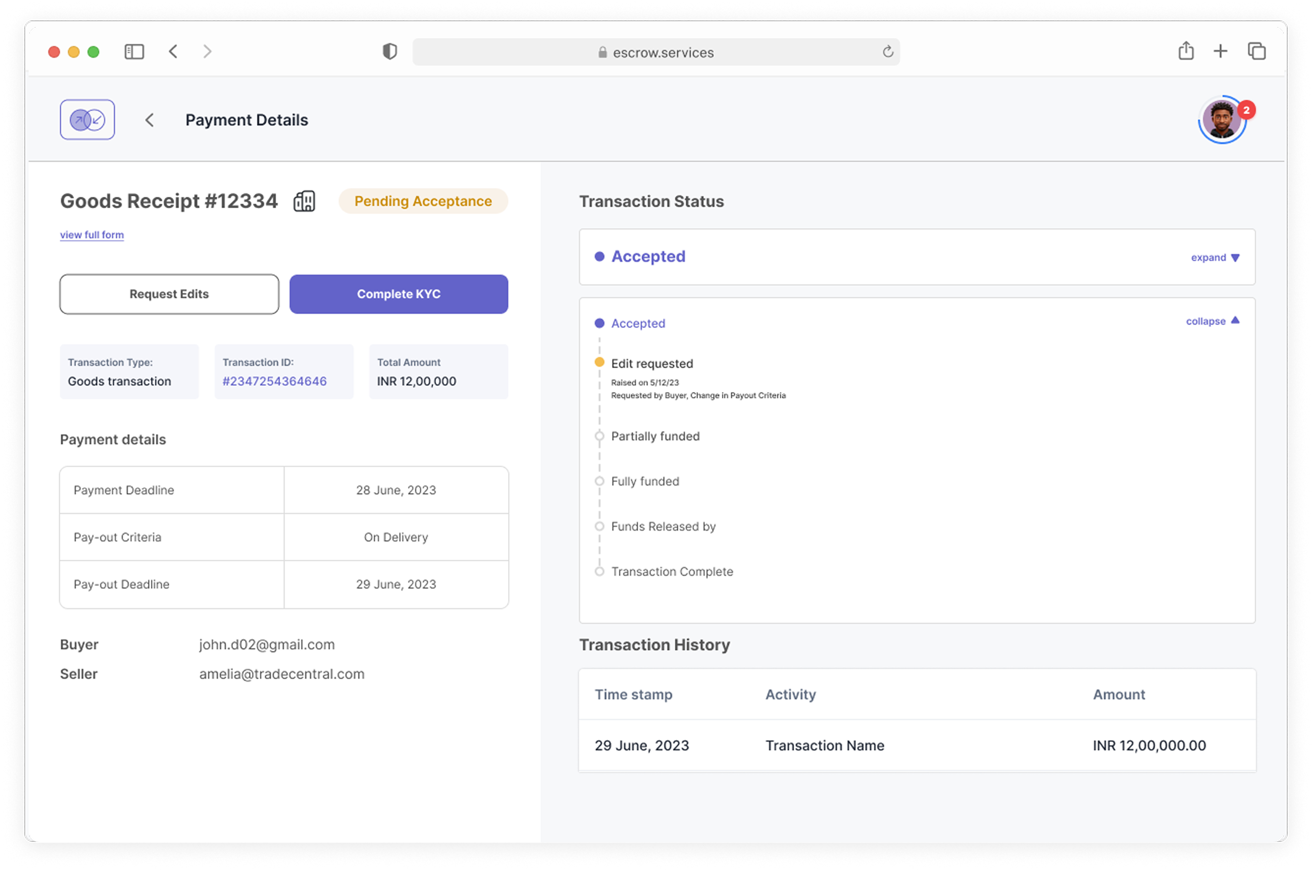
Fig. 8 — Pending state from the buyer's view. Status is clear, next action is Amelia's, and other transactions remain accessible.
Both parties complete KYC. John transfers funds. Status changes are tied to actions and ensure clarity.
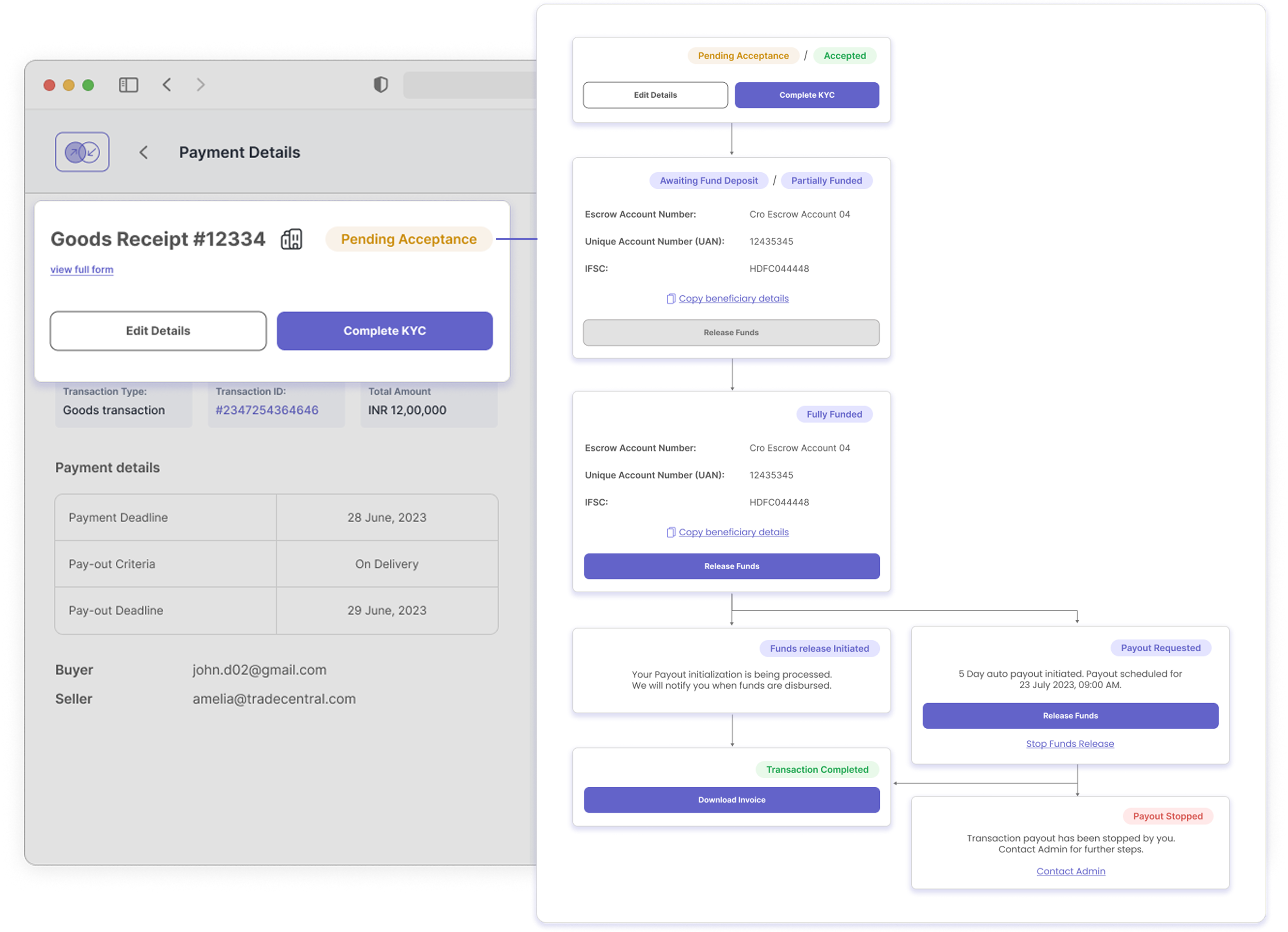
Fig. 9 — Accepted state: both parties have completed KYC, funds are locked, and status changes are tied to actions.
John releases funds on delivery confirmation. Amelia triggers payout with proof of delivery. Admin holds final authority.
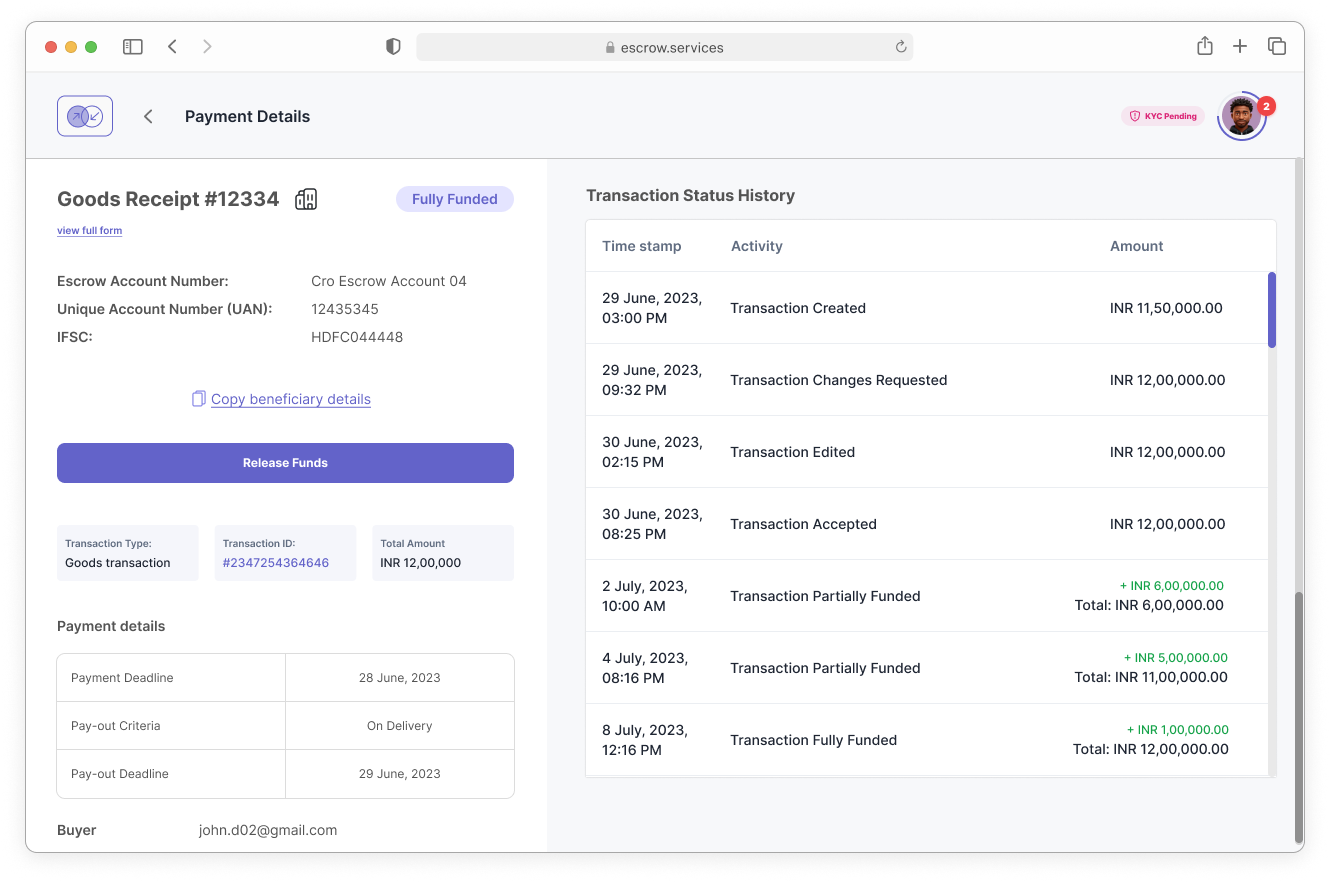
Fig. 10 — Completion flow: delivery confirmation, fund release request, and the admin's final approval step before payout.
Writing for anxiety
A UX writing exercise was necessary because of the sensitive nature of the transaction flow. We aimed to be specific, calm, and actionable — never vague, never alarming.
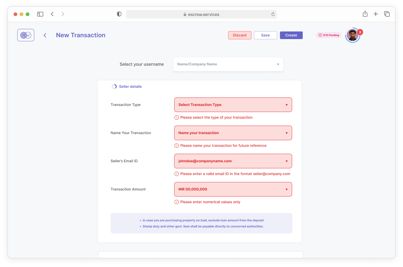
Fig. 11 — Error message system: specific language, calm tone, and a clear path forward for every failure state.
Safe at every size
Responsive experiences for mobile, tablet, and desktop emphasise safe monitoring. The hierarchy was simplified and actionable elements reduced — users could quickly understand transaction status without risking unintended interactions.
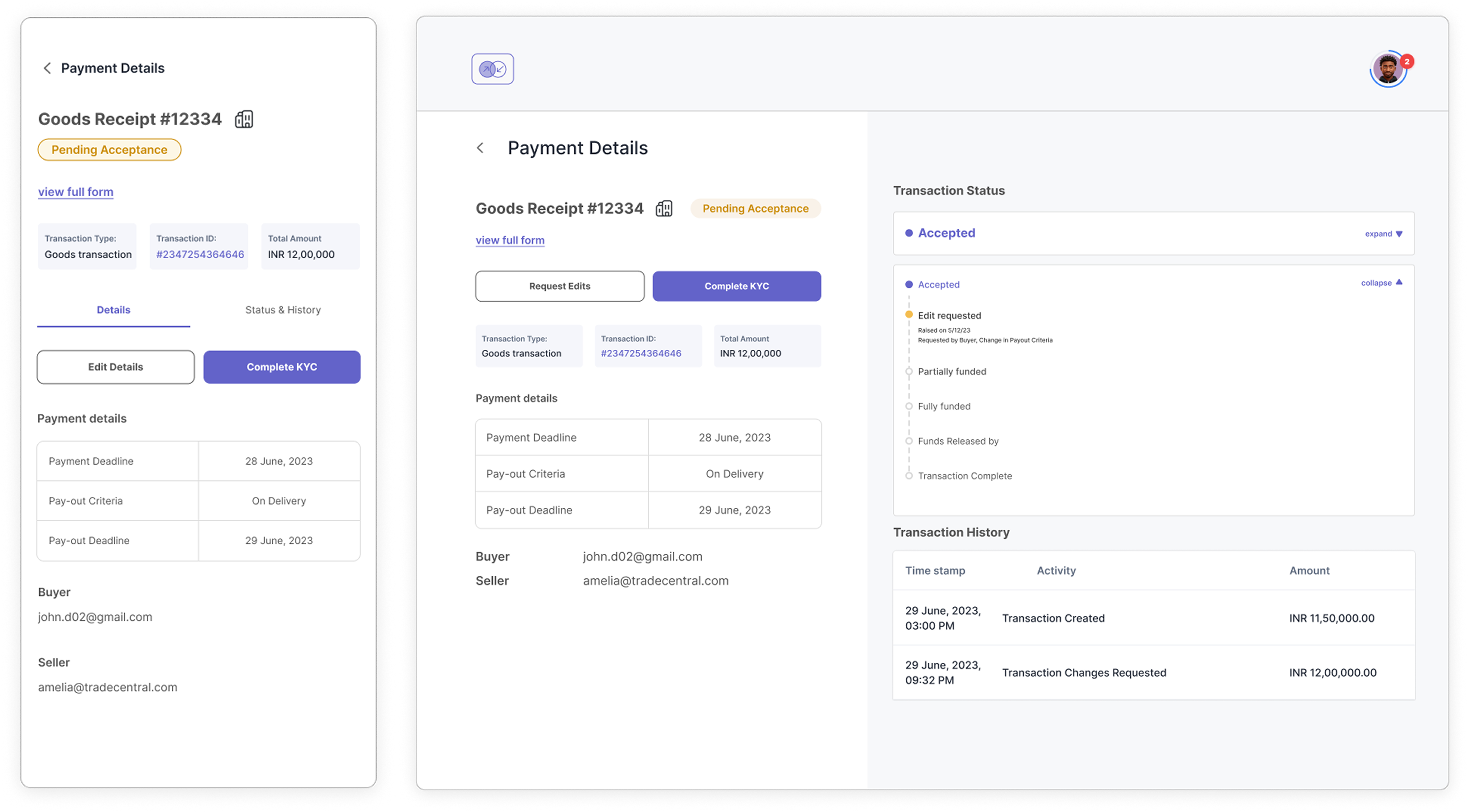
Fig. 12 — Mobile (read-only status), tablet (light actions), desktop (full interface). Priority shifts with screen size.